Azendoo is a French company that develops project management software for over 20,000 teams worldwide. Early in 2020, the company was acquired by a consulting firm called Alltech, and in the Summer when we reached out to Azendoo, the new CEO had begun the long process of migrating outdated code and updating the app’s interfaces. Perfect timing for us to connect with their user base and help guide development in the right direction.
With the CEO, we set a plan to rework the program in two parts: Desktop and Browser, and Mobile. We were tasked with revising the interface and making it more intuitive following the company’s acquisition. We interpreted “intuitive” to mean easy to learn and use, and began forming a direction for our research this way.
Our objectives:
Work with the development team to make the desktop application more intuitive based on insights from user research
Conduct ideation research and collaborate with the mobile developers to begin a full redesign of the Android and iOS apps
Research methodologies used: User interviews, usability testing, diary study, heuristic analysis, competitive analysis, personas, journey mapping, ideation/prototyping and testing
Phase 1: Desktop and Browser
Our first question: Where do Azendoo’s clients work?
The short answer is, of course, “everywhere,” but this is a consolidation of the many questions we asked to more accurately represent app users. Do most users work in an office or at home? What positions do power-users occupy? Are they product managers? Team members? Who’s using the mobile app? Who isn’t?
We began handling these questions, and others, by dedicating a large portion of our first sprint to interviewing expert users and beginning a diary study with daily Azendoo users. Those interviews gave us broad insight into existing use cases and the management styles of many long-term Azendoo clients.
Most users we spoke with were CEOs or high-level management using the software to streamline their organization’s work. In these conversations we collected a list of user pain-points such as confusing menu organization and task creation, as well as more significant issues with the program’s layout, feature set, and feature implementation.
What features do clients rely on?
Information from the previously mentioned interviews was compared to quantitative data we accessed via Kissmetrics and Google Analytics to determine the features most used and valued by clients. As a program centered around task management, the most used feature was, predictably, task creation and editing. Team management tools varied in importance depending on company size and type, but consisted primarily of communication features such as the platform’s announcement/activity feed, and the team task page.
Sample quantitative data used in our analysis
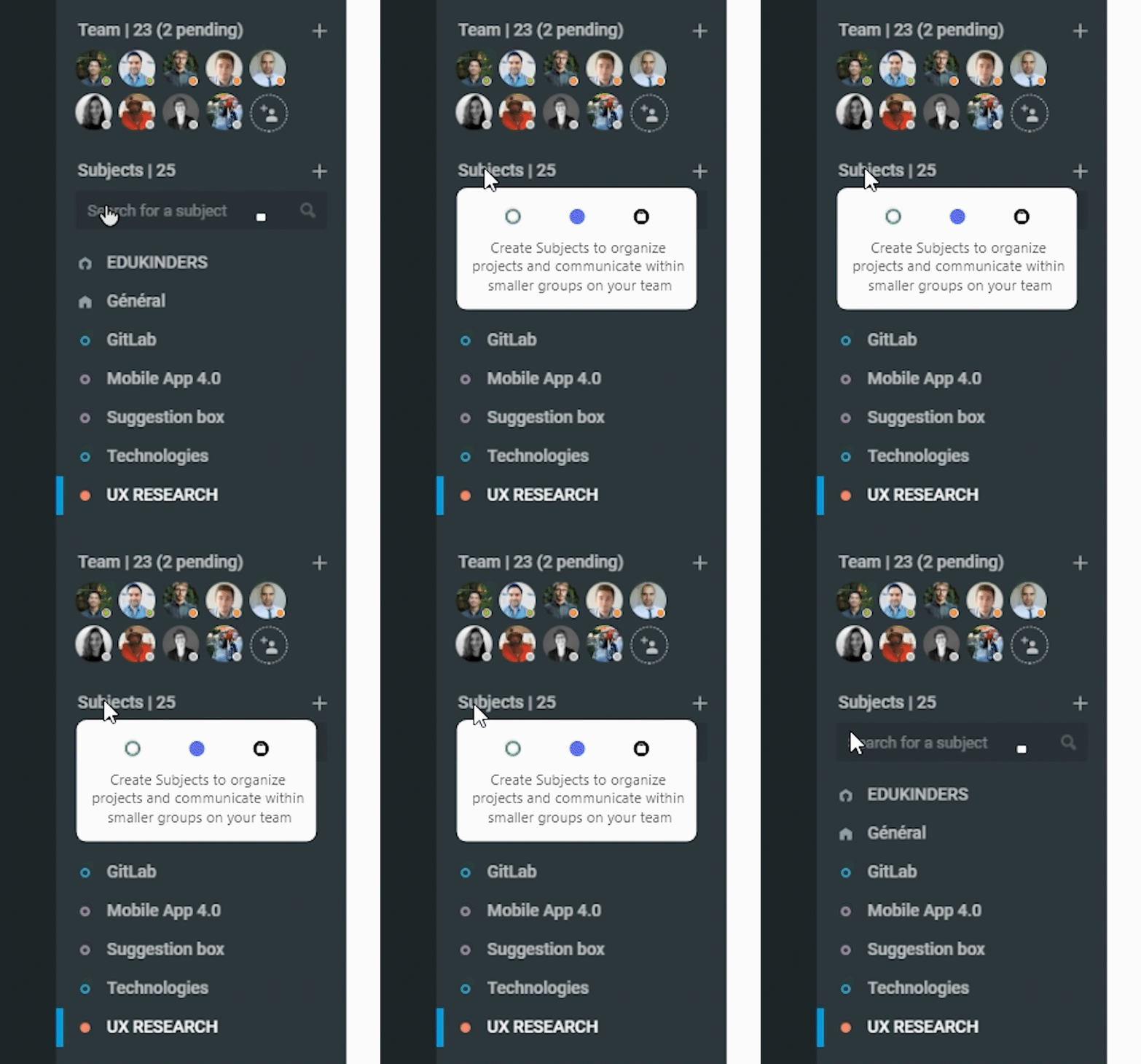
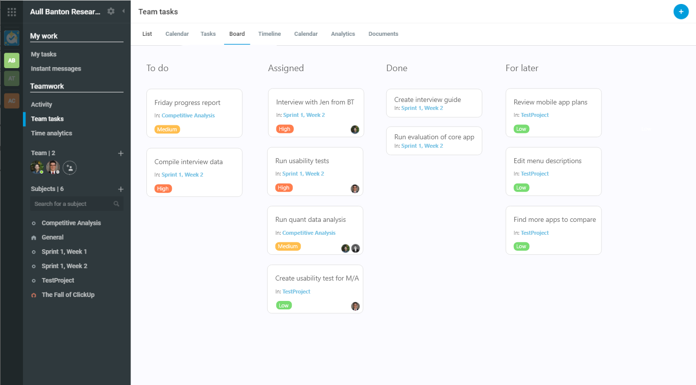
How can we better support clients and improve upon these features?Each sprint ended with a report and accompanying slide deck with insights from interviews, data analysis, novice user testing, and diary study and survey responses. These points, assisted by our heuristic evaluations, were used to triangulate problems and conceive realistic solutions the development team could implement. One of the main issues for clients was a lack of a proper team-view with universal visibility and clear task presentation. Sub-issues such as lack of task organization by priority and no Scrum-style team board were subjects we focused on for fix suggestions, prototyping alternative views that solved these issues. Another issue was lack of clarity in intended function and use of many smaller features. For this we prototyped a new onboarding system and context-dependent pop-up splashes for specific features. We also suggested changes to general UI organization and naming that showed improvement in learning/understanding during novice user testing. Over the course of our desktop-centric sprints we worked with the development team to refine the dev roadmap and incorporated the aforementioned changes as well as suggestions for smaller features such as group messaging that were closer to completion. “Closer to completion” here means they were on the team’s radar, but were marked low-priority (but actually were high priority to clients), or had been implemented already but in a way that did not fulfill clients’ core needs. We made sure to present a healthy mix of such “quick wins” with our more resource-intensive design suggestions.

Prototype context pop-ups for onboarding

Design prototype for a requested feature, the Team Board
In the sprints we spent on the desktop and browser platforms for the application, all of our suggestions were implemented in the following development cycle or added to the quarterly roadmap. Being able to connect with the development team and company leadership to help make the app the best version of itself was rewarding enough, but I got the most validation from seeing the decrease in negative support tickets and user churn.
Phase 2: Mobile
There was a need for a “full redesign” of the mobile application as it had not been updated since before the company’s acquisition.
We took insights from previous expert user interviews as well as conducting new interviews as a start to the ideation process for the new mobile application. These interviews helped us reinforce potential use cases for the mobile platform and focus the development team’s energy on a minimal feature set that functioned well on mobile and was powerful enough for most users.
Our first question for mobile was the same as it was for our desktop-centric sprints: Who might use Azendoo mobile? We combined insights from prior interviews with new, more mobile-focused interviews. This was the foundation for our compilation of user personas and use cases. With our list of “essentials” in place, we began ideation research.
I began to draft wireframes and hi-fi prototypes for application features, and we began recruiting participants for A/B testing and exploratory interviews regarding the new application. We spent two sprints on this process before the mobile project was unfortunately postponed due to company resource restraints. The development team is relatively small but very hardworking, and I am excited to see and be involved in their progress moving forward.
![[Prototype] Login screen](https://pro2-bar-s3-cdn-cf1.myportfolio.com/8d8c19f5-3bea-4b1e-936a-789401ad0306/24991609-0460-4781-a0b5-4b9d7d9bc254_rw_1920.png?h=64b51526aed617f67d016c11ac97933e)
[Prototype] Login screen
![[Prototype] New user signup](https://pro2-bar-s3-cdn-cf4.myportfolio.com/8d8c19f5-3bea-4b1e-936a-789401ad0306/fd9a941a-fb7a-42ce-be91-cd5cb1446c58_rw_1920.png?h=40991fd4254d68ad717a82644edd921b)
[Prototype] New user signup
![[Prototype] Task view](https://pro2-bar-s3-cdn-cf6.myportfolio.com/8d8c19f5-3bea-4b1e-936a-789401ad0306/a8e1f56a-7e1f-4b69-8eb4-53a81a4e86c1_rw_1920.png?h=ff5643d786298b2a411099362c4fb2e2)